In an era where every website looks the same, six precise signals separate a premium site from the rest. They directly determine your conversion rate.
A website that looks like every other site does not convert the way a site that immediately asserts its distinctiveness does. In 2026, the commoditization of WordPress templates and no-code builders has reached an unprecedented level of saturation: millions of businesses share the same fonts, the same layout blocks, the same color palettes. And yet, certain websites bring the scroll to a sudden stop, trigger an immediate sense of trust, and spark an instinctive desire to stay. That feeling is not accidental. It is the sum of six precise signals, readable by any visitor and recognized unconsciously by the most discerning minds. Here is how to identify them, master them, and put them to work for your conversion.
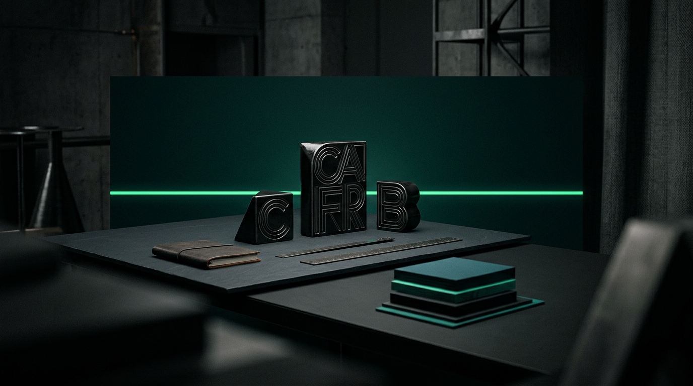
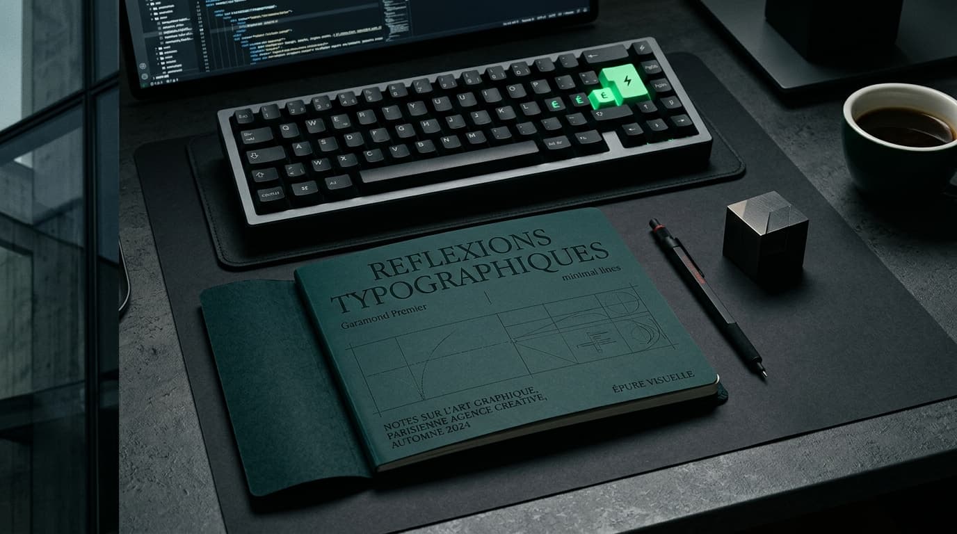
Typographic restraint and hierarchy: typography as a primary material
The first thing a visitor perceives on a website is not an image. It is a reading sensation, an information hierarchy, a visual rhythm that typography orchestrates before a single word of content is actually read. Generic sites systematically overlook this. Premium sites build their entire foundation on it.
Using custom or rare typefaces is now a standalone status signal. Where a WordPress-template site reaches for Inter, Roboto, or Open Sans, a premium site invests in a foundry license: Söhne from Klim Type Foundry, Canela from Commercial Type, Graphik from Acutype, or even bespoke typefaces commissioned by agencies like Mazarine, the Paris-based communication agency of reference for luxury houses, whose website is a precise embodiment of this typographic discipline.
But the typeface alone is not enough. What sets a premium site apart is the control of space: large-scale headlines (100px, 120px, sometimes more), generous line heights, breathing room between sections, and rigorous margins. Linear, the project management tool embraced by the world's best tech teams, is the perfect expression of this absolute restraint: few colors, a controlled typeface, and white space treated as a design element in its own right. The result is perceived as immediately superior.
The impact on conversion is well documented. According to an Adobe study published in 2023, 38% of visitors will leave a website if the layout or content is deemed unattractive. Typography is the primary variable in that perceived attractiveness. A clear hierarchy reduces cognitive load, naturally guides visitors toward the call to action, and strengthens brand recall. In other words, investing in a strong typographic identity is not an aesthetic indulgence. It is a business decision.
For brands seeking to occupy a premium, high-end, or luxury space, typography must be treated as a primary material in the same way that wood, leather, or metal is for a maker of exceptional objects. It is the visual texture of your positioning. It must be consistent across every headline, every subheading, every caption. It must be chosen deliberately, not defaulted to.
Subtle animations and motion design: movement that guides without distracting
Motion is the second great indicator of a site's caliber. But a word of caution: here, subtlety outweighs spectacle. Gratuitous animations, intrusive pop-ups, and poorly calibrated parallax effects are the hallmarks of the generic sites that defined the period from 2015 to 2020. In 2026, premium motion design is invisible in the sense that it is not seen, it is felt.
Strategic scrollytelling, the practice of triggering animations as the user scrolls down the page, has become a full-fledged storytelling tool. Stripe, the global leader in online payments, has offered the most accomplished example of this for years: each section unfolds with millimeter precision, elements enter the frame with smooth transitions, and the visitor is guided, without realizing it, from one argument to the next, from one proof point to the following. The effect is that of a fluid, almost instructional demonstration that builds trust with every scroll.
The GSAP library (GreenSock Animation Platform) is today the technical benchmark for achieving this level of precision. It allows every micro-transition to be controlled with a granularity that CSS animations and generic libraries simply cannot match. Studios and agencies that master GSAP deliver an experience that visitors cannot quite name, but instantly feel as superior.
The impact on conversion is significant. A 2023 HubSpot study found that pages incorporating interactive storytelling elements record an average engagement rate 22% higher than equivalent static pages. More concretely, time spent on the page increases, and every additional second a visitor spends on a site mechanically raises the probability of conversion.
The golden rule of premium motion design can be stated simply: every animation must have a functional reason to exist. It draws attention to a key element, reveals information progressively, or creates a logical transition between two arguments. If an animation serves no narrative or navigational purpose, it has no place. This principle of restraint is precisely what separates Vokode, the creative agency that built its reputation on cinematic web experiences, from studios that pile on effects to impress rather than to persuade.
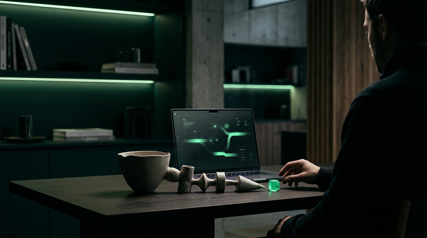
Intelligent AI integration: qualifying your prospects while you sleep
The third premium signal of 2026 is no longer purely visual. It is functional. Integrating a high-end conversational AI into the user journey has become a major differentiator between the sites that perform and the ones that disappoint.
This is not about the generic chatbot pasted in the bottom-right corner of the page, the one that replies "Hello, how can I help you?" before redirecting to a FAQ. That kind of tool does more damage to your brand than good. The premium AI of 2026 is woven organically into the user journey: it knows your offer, your editorial voice, your customer segmentation. It can understand the nature of a request, qualify the prospect against predefined criteria, and intelligently route them to the right action, whether that is booking a call, downloading a resource, or connecting directly with the right person on your team.
This is exactly what IRIS does, the proprietary conversational assistant developed by Paradeyes. IRIS is designed to integrate into premium web environments without disrupting the experience, while respecting the brand's visual identity and tone of voice. It reduces response time to zero, pre-qualifies inbound requests, and allows commercial teams to focus exclusively on the most relevant prospects.
The numbers speak for themselves. According to a McKinsey report published in 2024, companies that integrate AI-powered lead qualification into their customer journey reduce their acquisition cost by an average of 30% and increase their inbound conversion rate by 25%. Even light-touch personalization of the journey creates a sense of individual attention, which is precisely what a premium client is looking for.
The challenge is to position this technology not as a cold automation tool, but as an extension of your client service. A corporate law firm, a high-end aesthetic clinic, or a renowned architecture studio does not need a chatbot. It needs an assistant capable of reflecting its standard of excellence, welcoming every visitor with the precision of a senior client director, and turning every visit into a qualified opportunity.
Accessibility and inclusivity: ethics as a signal of strength
Web accessibility has long been treated as a regulatory constraint, a technical checkbox handled at the end of a project, rarely seen as a strategic asset. In 2026, that reading is obsolete. For a premium website, accessibility is a signal of maturity, rigor, and ethics that directly reinforces brand perception.
The WCAG 2.2 standards (Web Content Accessibility Guidelines), published by the W3C in October 2023, define a precise framework: sufficient color contrast between text and background (a minimum ratio of 4.5:1 for body text), full keyboard navigation, alternative text on all images, and automatic captions on video content. These requirements, routinely overlooked by generic templates, are built into every site developed with a premium ambition.
Why does this affect conversion? The answer is twofold. First, search engines, Google above all, incorporate accessibility criteria into their ranking algorithms. An accessible site is a better-indexed site, more legible to crawlers, and better positioned in search results. Google confirmed in its 2023 Search Central documentation that semantic HTML structure, ARIA attributes, and keyboard navigation contribute to its bots' understanding of page content. Second, a brand that publicly demonstrates its commitment to accessibility sends a strong ethical signal. For a medical practice, a beauty brand, or a wealth management consultancy, that signal is a genuine differentiator.
Apple is the canonical example of this synthesis between accessibility and excellence. Every product, every interface update, every page on its website integrates accessibility features that never degrade the experience for non-disabled users. They enhance it. This principle should guide every premium web project: accessibility is not a compromise. It is an additional standard of excellence.
Flawless technical performance: speed as a commercial argument
The fifth premium signal is one your visitors never see, but feel within the first few seconds. A site's technical performance is one of the most decisive factors in conversion, and one of the most consistently underestimated by decision-makers without a deep digital background.
Core Web Vitals, Google's performance framework, measures three key indicators: LCP (Largest Contentful Paint, the time it takes to display the main content), FID or INP (First Input Delay and Interaction to Next Paint, measures of interactive responsiveness), and CLS (Cumulative Layout Shift, the visual stability of the page). A premium site must achieve an LCP below 2.5 seconds, an INP below 200 milliseconds, and a CLS below 0.1. These are the thresholds at which Google considers a page to deliver a good user experience.
The consequences of a slow site on conversion are documented with precision and without ambiguity. An Akamai study widely cited since 2017 and confirmed by more recent Google research establishes that a 100-millisecond delay in a site's response time can reduce the conversion rate by 7%. Google also published data in 2020 showing that a site going from 1 to 3 seconds in load time sees its bounce rate increase by 32%. Between 1 and 5 seconds, that bounce rate climbs to 90%.
The technical stack that premium agencies choose for their clients is not incidental. Next.js, the React framework developed by Vercel, enables hybrid rendering (static and server-side) that optimizes performance at every level. Vercel, the edge hosting platform, distributes resources as close as possible to the end user anywhere in the world, mechanically reducing latency. Serving images in modern formats (WebP, AVIF), lazy loading non-critical assets, minifying JavaScript: each of these technical decisions is invisible to the visitor but critical to the fluidity of their experience.
A slow website in a premium market is a contradiction in terms. No one would accept waiting in a luxury boutique. Why should they accept it online?
Cross-channel consistency: a brand recognizable anywhere
The sixth and final signal is perhaps the most strategic, because it transcends the website itself to encompass your brand's entire footprint across the digital and physical world. Cross-channel consistency is your brand's ability to be recognized instantly, regardless of the touchpoint: website, LinkedIn page, email signature, PowerPoint presentation, business card, event stand.
This consistency is not a creative constraint. It is a commercial advantage. A Lucidpress study published in 2022 found that brands maintaining visual and editorial consistency across all their materials record an average revenue increase of 23%, driven by stronger recognition and greater trust among prospects and clients.
In practice, this means your color palette, your typographic system, your editorial voice, your approach to structuring an argument, and your photographic treatment must all be the same on your website, your LinkedIn profile, your newsletters, and your commercial proposals. When a prospect discovers you on LinkedIn on Monday and visits your website on Wednesday, they should feel they are encountering the same entity, the same standard of excellence, the same promise.
Vercel is a perfect illustration of this in the tech world: whether you browse its website, read its blog, consult its documentation, or follow its X account, you encounter the same rigor, the same visual grid, the same direct and expert tone. This consistency creates a compounding effect: every touchpoint with the brand reinforces the previous impression rather than diluting it.
For premium brands, this challenge is all the more critical because their clientele is demanding, attuned to detail, and unforgiving of inconsistencies. A consulting firm with an impeccable website but sloppy PowerPoint presentations sends a dissonance signal that undermines hard-won trust. Cross-channel consistency is the promise maintained under every circumstance. It is the final stretch of the commercial sprint.
Conclusion: Paradeyes, mastering all six signals for seven years
These six signals are not optional features. In 2026, they are the entry threshold for the premium tier. A site that masters one or two without embracing the others remains an incomplete site, one that fails to capitalize on its full conversion potential.
At Paradeyes, a premium creative agency based in Cannes, each of these signals is integrated from the strategy phase, before the first wireframe is ever produced. Our technical stack is built on Next.js for performance and scalability, Sanity for structured and flexible content management, Supabase for real-time data, Vercel for global edge hosting, and GSAP for motion design that meets the most demanding international standards. IRIS, our proprietary conversational assistant, transforms every site into an intelligent qualification surface, available around the clock.
This technical and creative mastery is the result of seven years working alongside leading advertisers: Volkswagen, Mini, Magnum, Air France, Unilever. Brands that accept no compromise on the quality of their digital presence, and who taught us that every design decision is a business decision.
If you are reading this article, you already sense that your current website may no longer reflect the level of ambition your brand deserves. The good news is that the six signals described here are measurable, improvable, and their impact on conversion is well documented.
Book a 30-minute discovery call with our team. We will audit the premium perception of your current site together, identify the missing signals, and present you with a concrete roadmap to position your brand exactly where it belongs.