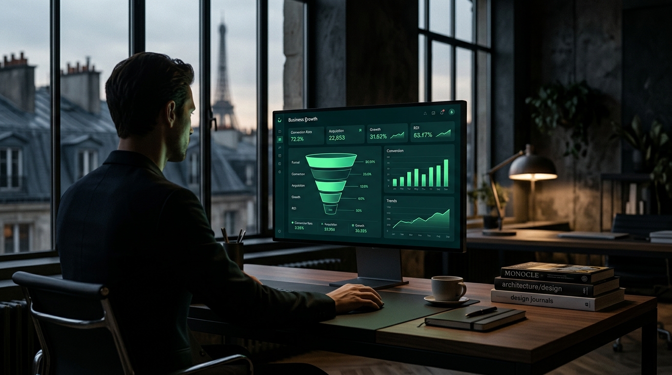
A visually appealing website is not enough to generate leads. Here are the six reasons your Cannes-based site is failing to convert, along with concrete fixes you can start applying right now.
You invested in a website. It's live, it looks the part, and your team is proud of it. Yet your phone isn't ringing any more than it did before. Your inbox stays quiet. And your competitors seem to be capturing exactly the prospects you're targeting.
This is one of the most common situations we encounter at Paradeyes Agency, working with SME owners, independent professionals, and premium service providers based on the French Riviera. The cause is almost never aesthetics. It's structural. A website that fails to convert typically suffers from six specific dysfunctions, all identifiable and all fixable. Here is the full diagnosis.
Nonexistent or Misconfigured Local SEO
The symptom is easy to check: search for your type of business followed by "Cannes" in Google. Do you appear in the top three organic results? Do you show up in the Google Local Pack, the block of three listings that appears above standard results? If the answer is no to both, a significant portion of your potential clients simply cannot find you.
The problem is often two-fold. On one side, the Google Business Profile is missing, unclaimed, or filled in with bare-minimum information. On the other, the website content relies on generic keywords ("communications agency," "attorney," "interior designer") with no geographic anchoring in title tags, meta descriptions, H1 headings, or body copy.
The data is clear: according to BrightLocal, 98% of consumers use the internet to find a local service provider, and 76% of people who conduct a local search on a smartphone visit a business within the same day (BrightLocal, Local Consumer Review Survey, 2023). In Cannes, where competition among premium providers is fierce and clients expect curated options, failing to rank at the top of local results is the equivalent of being invisible.
The fix comes down to three actions: fully optimize your Google Business Profile with recent photos, accurate hours, and a description written around your core business and geographic keywords; integrate location-specific variants such as "in Cannes," "Cannes French Riviera," and "Côte d'Azur" into the strategic tags of every page; and create at least one dedicated piece of content that explicitly roots your brand in the local territory.
A First Impression That Says Nothing Within Five Seconds
You have five seconds. That is the average window in which a visitor decides to stay on a site or leave. This finding, confirmed by the Nielsen Norman Group, is one of the most defining constraints in modern web design. Five seconds for your visitor to understand what you do, who you do it for, and why you are the right choice.
A failing hero section is easy to recognize: a generic stock photo, a vague headline along the lines of "Welcome" or "Excellence at Your Service," and no clear indication of who the offer is for. The result is that the visitor doesn't see themselves in it. They can't tell whether your offer applies to them. They leave.
The business impact is direct: according to HubSpot, 94% of first impressions of a website are design-related, and a site whose visual identity is perceived as outdated or generic generates a significantly higher bounce rate (HubSpot, State of Marketing Report, 2024). In Cannes, where clients are visually sophisticated and discerning, this effect is even more pronounced.
The fix requires rethinking the hero section around three non-negotiables: a headline that explicitly names your target audience and the primary benefit you deliver, a supporting line that spells out your differentiation, and a visual that embodies your brand world rather than a neutral, personality-free backdrop. This is not a styling exercise. It is a strategic clarity exercise.
Technical Slowness That Kills Conversion Before It Starts
If your site takes more than three seconds to load, you are losing a substantial share of visitors before they have even seen your content. Google has quantified this: for every additional second of load time between one and five seconds, the bounce rate increases by 90% (Google/Deloitte, Milliseconds Make Millions, 2020). This is not an approximation. It is a direct measurement across millions of mobile sessions.
The diagnosis takes two minutes using Google's PageSpeed Insights tool. A score below 70 on mobile signals a serious problem. The most common causes are consistently the same across sites: uncompressed images uploaded straight from a camera, entry-level shared hosting, no browser caching, unminified CSS and JavaScript, and web fonts loaded from an external server without preloading.
Core Web Vitals, Google's performance measurement standard since 2021, assess three dimensions: Largest Contentful Paint (LCP, how quickly the main content loads), Cumulative Layout Shift (CLS, visual stability), and Interaction to Next Paint (INP, responsiveness). Poor scores on these three metrics hurt your organic rankings on top of degrading the user experience.
The fix requires technical intervention: compressing and converting images to WebP format, migrating to a high-performance hosting provider, setting up a CDN if your audience is geographically distributed, and auditing the codebase to eliminate render-blocking resources. These optimizations are invisible to the eye but decisive for conversion.
An Information Hierarchy That Buries the Message
A site can be fast, visually strong, and well-ranked, and still fail to persuade because its narrative structure is disorganized. The visitor scrolls, reads a few paragraphs, doesn't understand what they're supposed to do next, and leaves. This symptom shows up as a short average session duration despite a moderate bounce rate, combined with a low pages-per-visit count.
The root cause is the absence of a clear, hierarchical value proposition. Too many sites stack content blocks without a logical user journey: a company overview, then services, then an "our story" section, then a photo gallery, in an order that follows the company's internal logic rather than the visitor's mental questions.
The visitor arrives with one specific question: "Can this provider solve my problem, and do they deserve my trust?" Your page structure must answer that question in exactly this order: identify the problem, present the solution, establish credibility, and invite action.
According to Hick's Law, applied to interface design, every additional option presented to a user increases their decision time and reduces the likelihood they will act (Hick, 1952, replicated across numerous modern UX studies). The concrete fix is to restructure each page around a single conversion goal, remove content blocks that don't contribute to it, and create a natural top-to-bottom reading flow that guides the visitor toward one clear action.
Calls to Action Too Weak to Trigger Anything
"Contact us." "Learn more." "Discover our services." These phrases appear on thousands of websites. They rarely work, because they don't tell the visitor what they'll get by clicking, they don't speak to where the visitor is in their buying journey, and they create no urgency or perceived value.
The observable symptom is a low click-through rate on buttons, measurable via tools like Google Analytics 4 or Microsoft Clarity. The business impact is significant: according to Unbounce, changing the text on a call-to-action button can increase conversion rates by up to 90% (Unbounce, Conversion Benchmark Report, 2023). Button copy is not a cosmetic detail. It is a direct performance lever.
The fix rests on two principles. First, the call to action must state a concrete benefit: "Book my free strategy call," "Download the guide," and "Get my quote within 48 hours" are infinitely more effective than "Contact us." Second, your site should offer multiple engagement levels matched to the visitor's readiness: a strong CTA for those ready to decide, and an intermediate CTA (a download, a newsletter, a guide) for those still in research mode. A progressive conversion strategy multiplies entry points into your funnel without forcing premature decisions.
Trust cannot be declared. It has to be demonstrated. And it is demonstrated through tangible elements that your visitor can assess independently, without having to take your word for it. That is the role of social proof: detailed client testimonials, concrete results backed by numbers, recognizable client logos, certifications, and verified Google reviews.
The symptom of a site lacking sufficient social proof is a polished presentation of the offer with nothing external to validate it. From the visitor's perspective, it's a promise without a guarantee. According to the Spiegel Research Center, displaying customer reviews increases a website's conversion rate by an average of 270% for high-perceived-value products and services (Spiegel Research Center, Northwestern University, 2017). Social proof is not an optional add-on. It is a fundamental conversion mechanism.
In Cannes and across the French Riviera, premium clients are particularly sensitive to peer reputation. A business owner looking for a trusted provider for a high-stakes project will not take a chance based solely on a well-designed website. They will look for external validation signals.
The concrete fix: systematically collect structured testimonials after every successful engagement, asking clients to describe the challenge they faced before working with you, the solution provided, and the outcome achieved. Turn your best results into case studies with measurable metrics. Display the logos of your most recognized clients with their permission. These elements must be visible on the homepage, not buried in a "References" tab that nobody visits.
Conclusion: A Website That Thinks Business First, Aesthetics Second
These six dysfunctions share one thing in common: they all stem from a confusion between building a beautiful website and building a website that works. A high-performing site is not a showcase. It is a salesperson available around the clock, capable of qualifying a prospect, building trust, and triggering a first contact, all without any manual input from you.
At Paradeyes Agency, a premium creative agency based in Cannes and Paris, we approach every website project through the lens of business performance before aesthetics. Creative execution comes second. It serves conversion; it does not replace it. Each of the six levers described in this article is subject to a precise diagnostic during our analysis sessions, followed by a structured, prioritized action plan tailored to your market and positioning.
If your website exists but isn't generating leads at the level your business deserves, the first step is a thirty-minute conversation to identify where the main bottleneck lies.
Book your 30-minute discovery call at [paradeyesagency.com](https://www.paradeyesagency.com). No commitment required, just a clear and honest diagnosis.